Pottery Barn Website Redesign
Redesigning an e-commerce platform for clarity
Used Tools
Illustrator
InDesign
Figma
This case study reimagines PotteryBarn.com
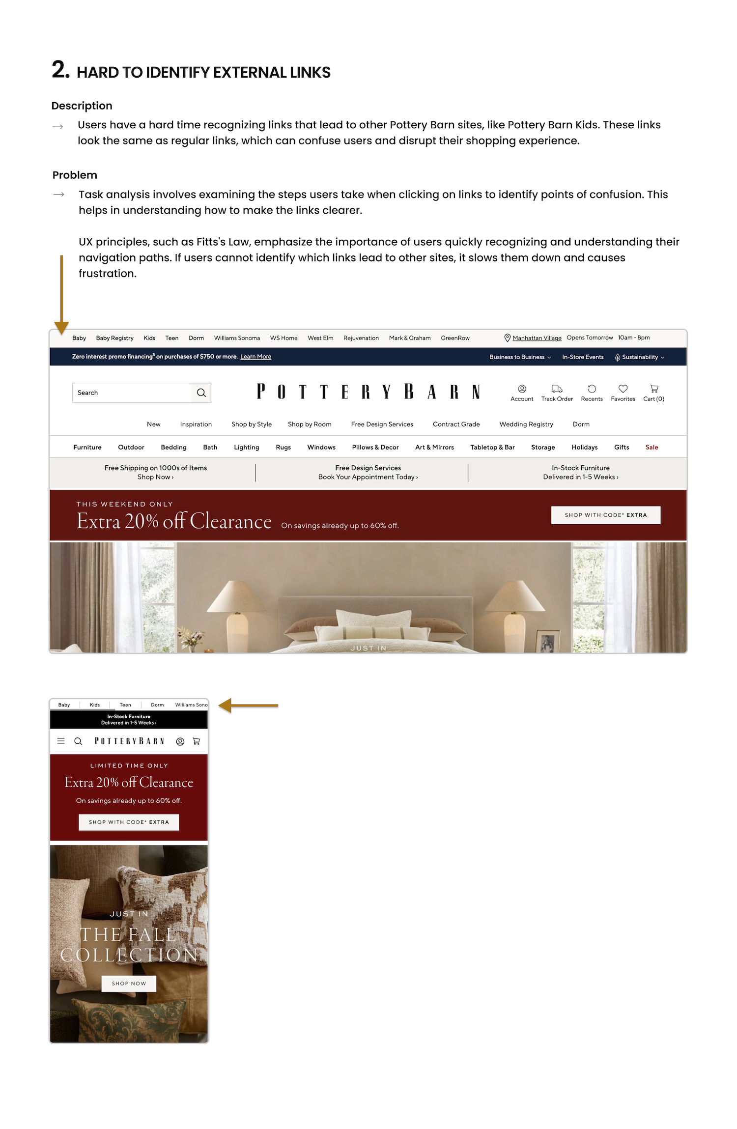
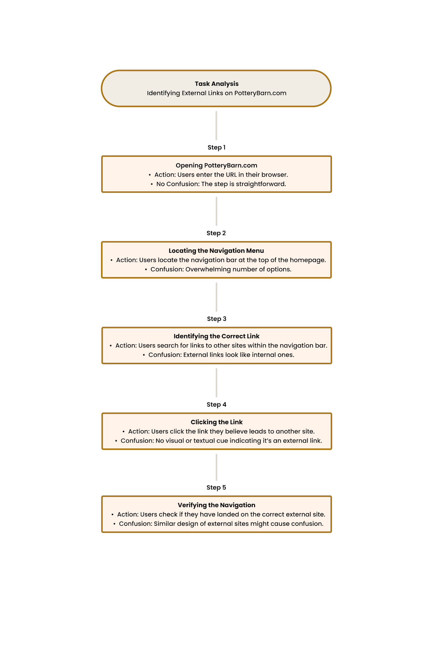
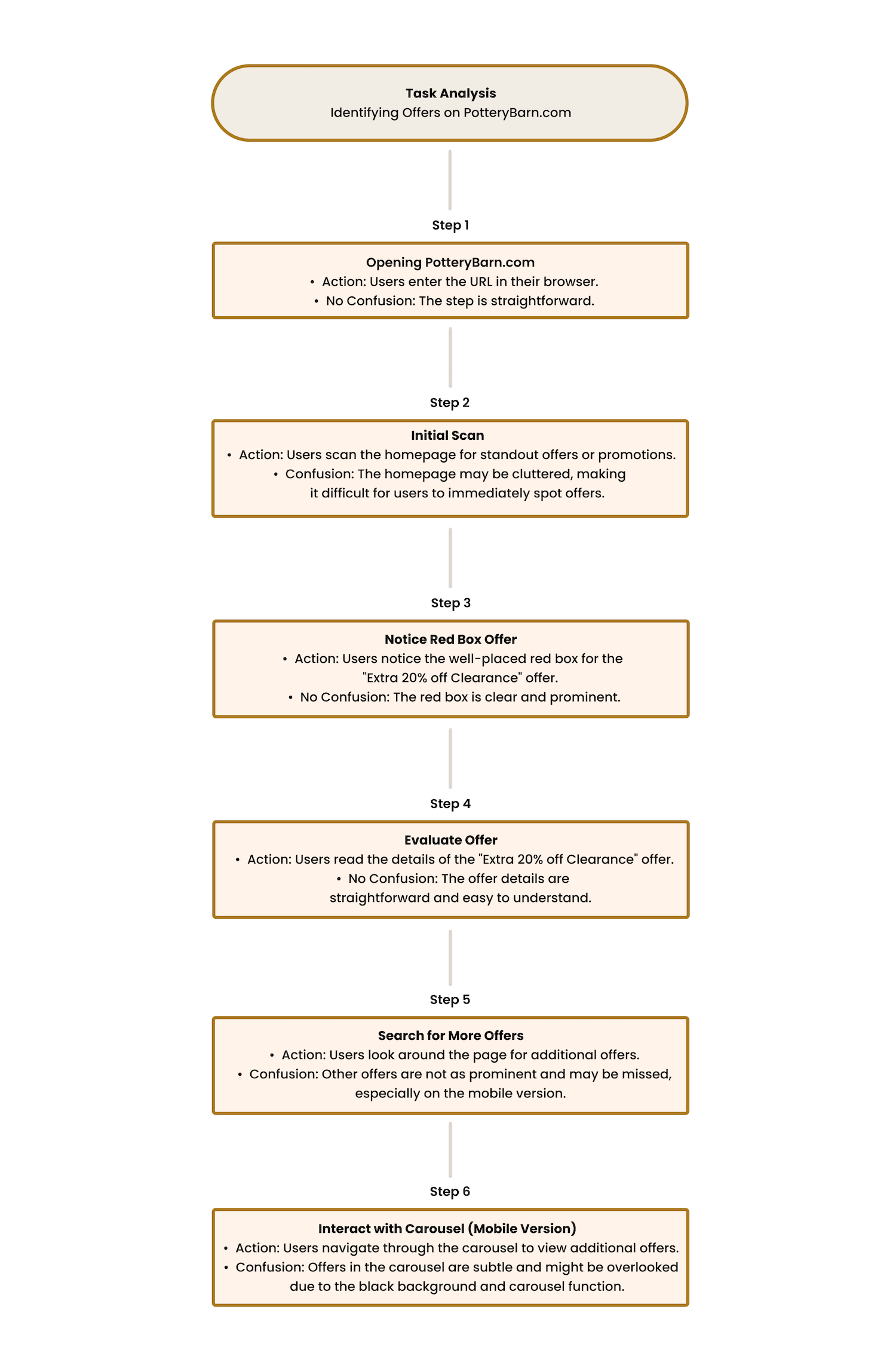
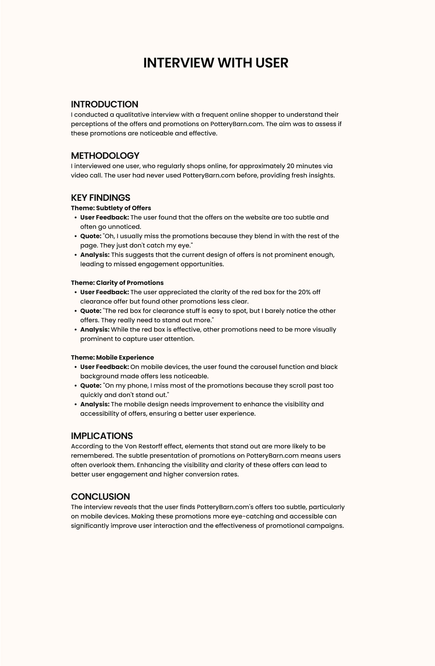
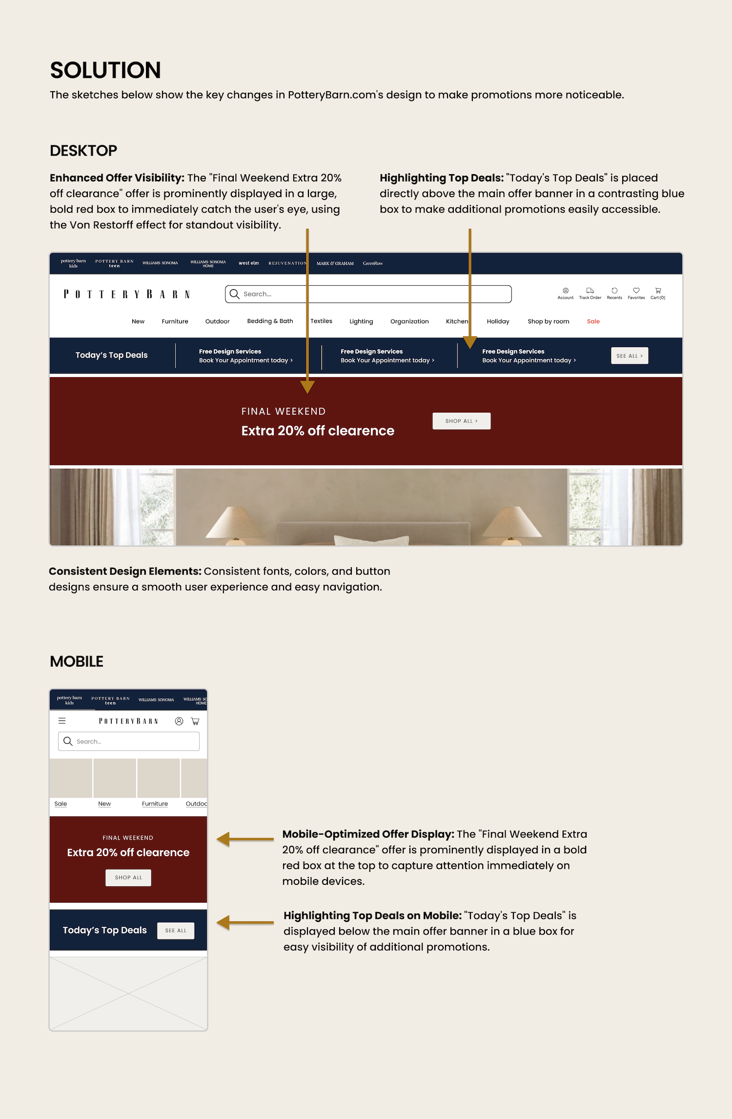
This case study explores a redesign of PotteryBarn.com, with a focus on making the shopping experience easier to understand and navigate.
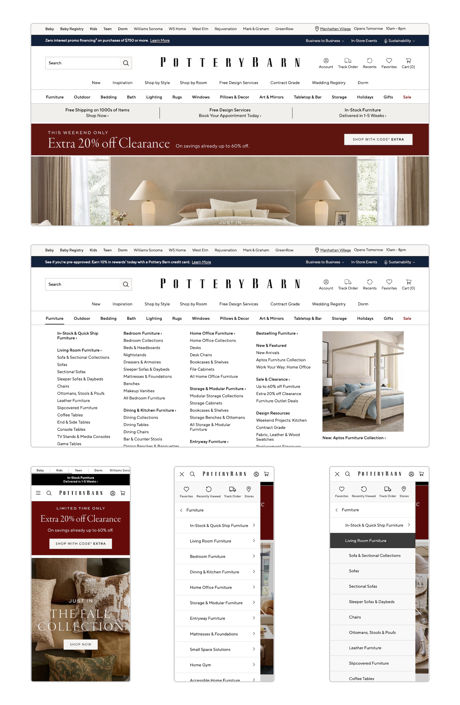
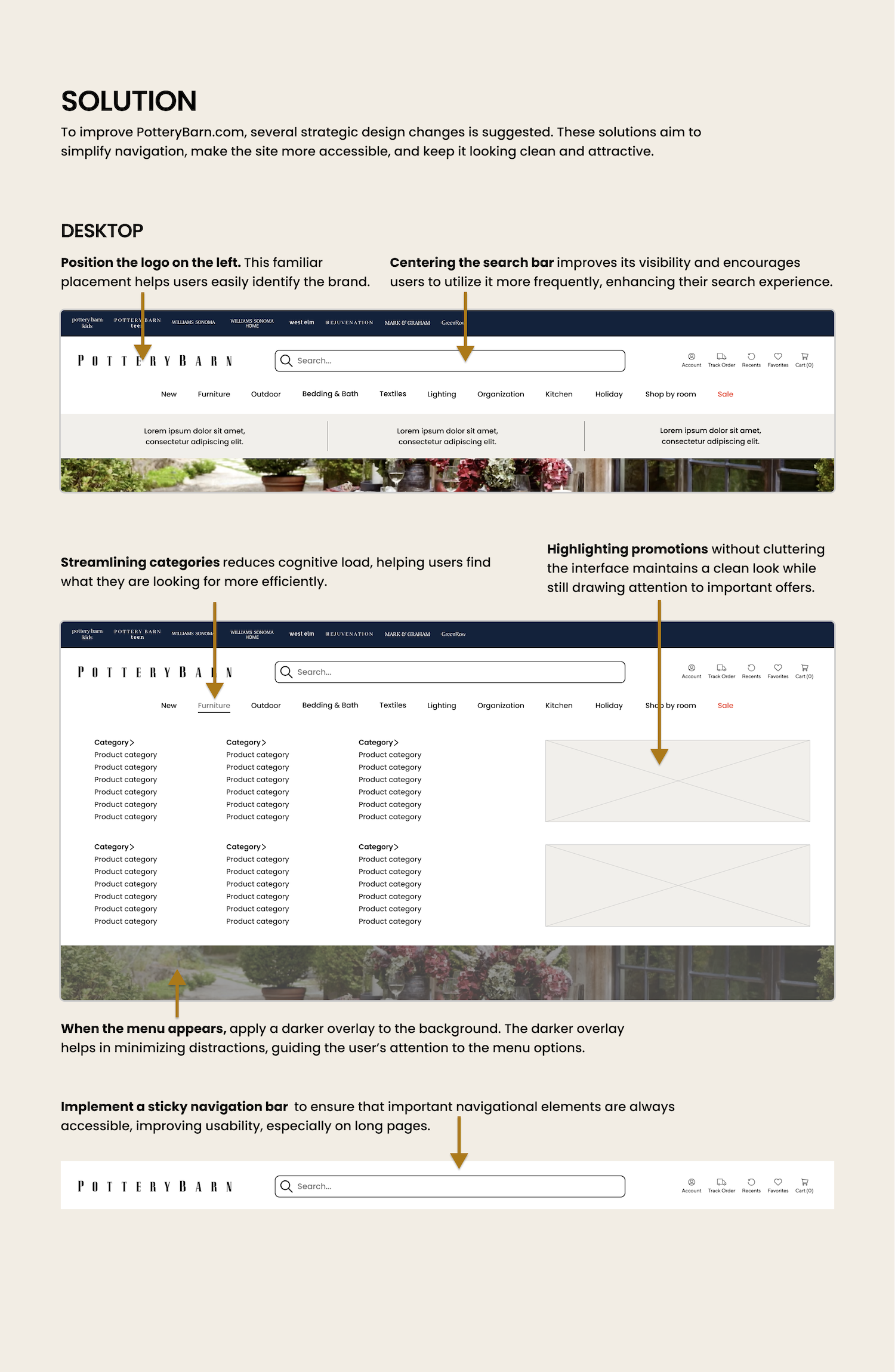
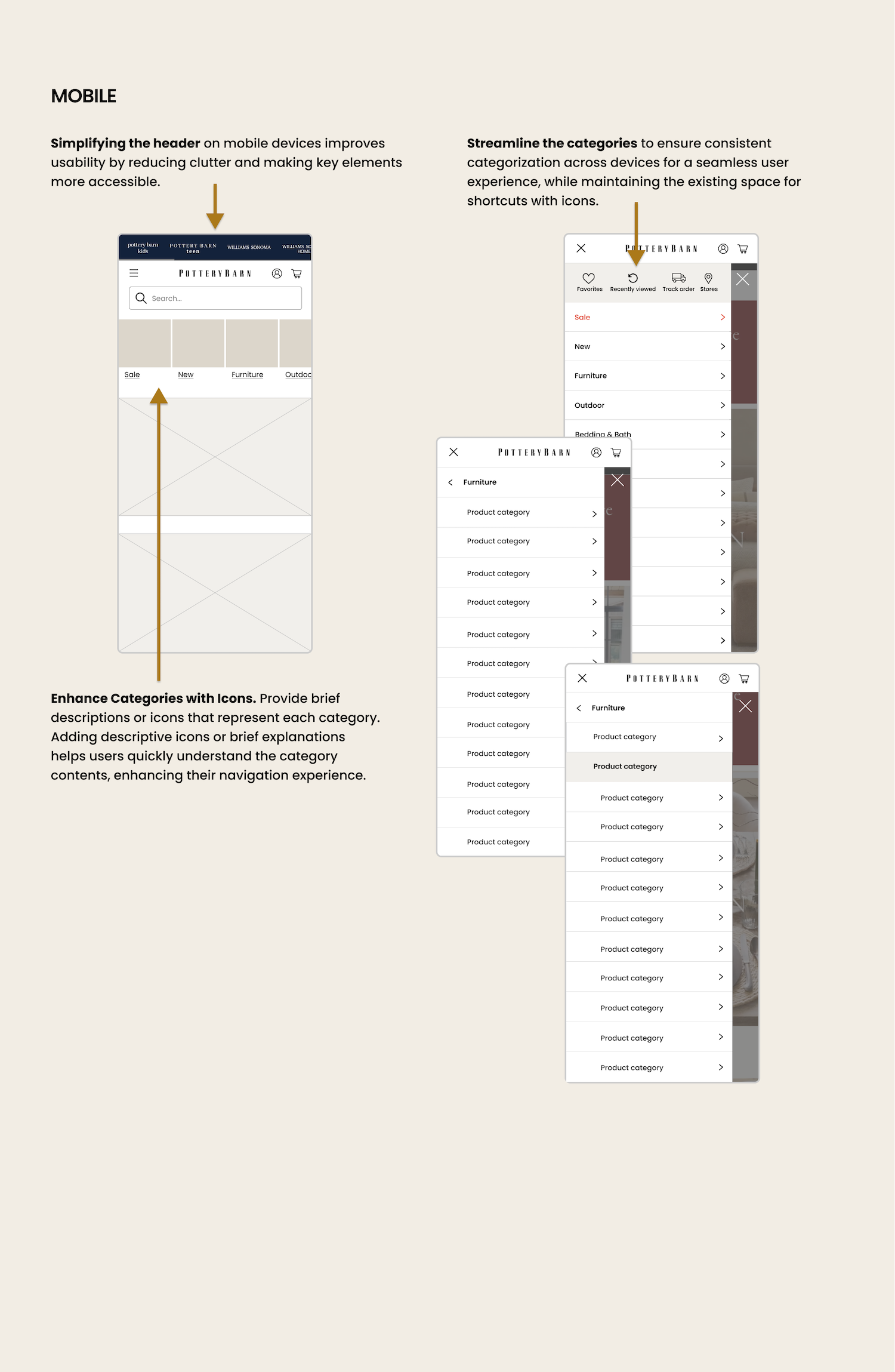
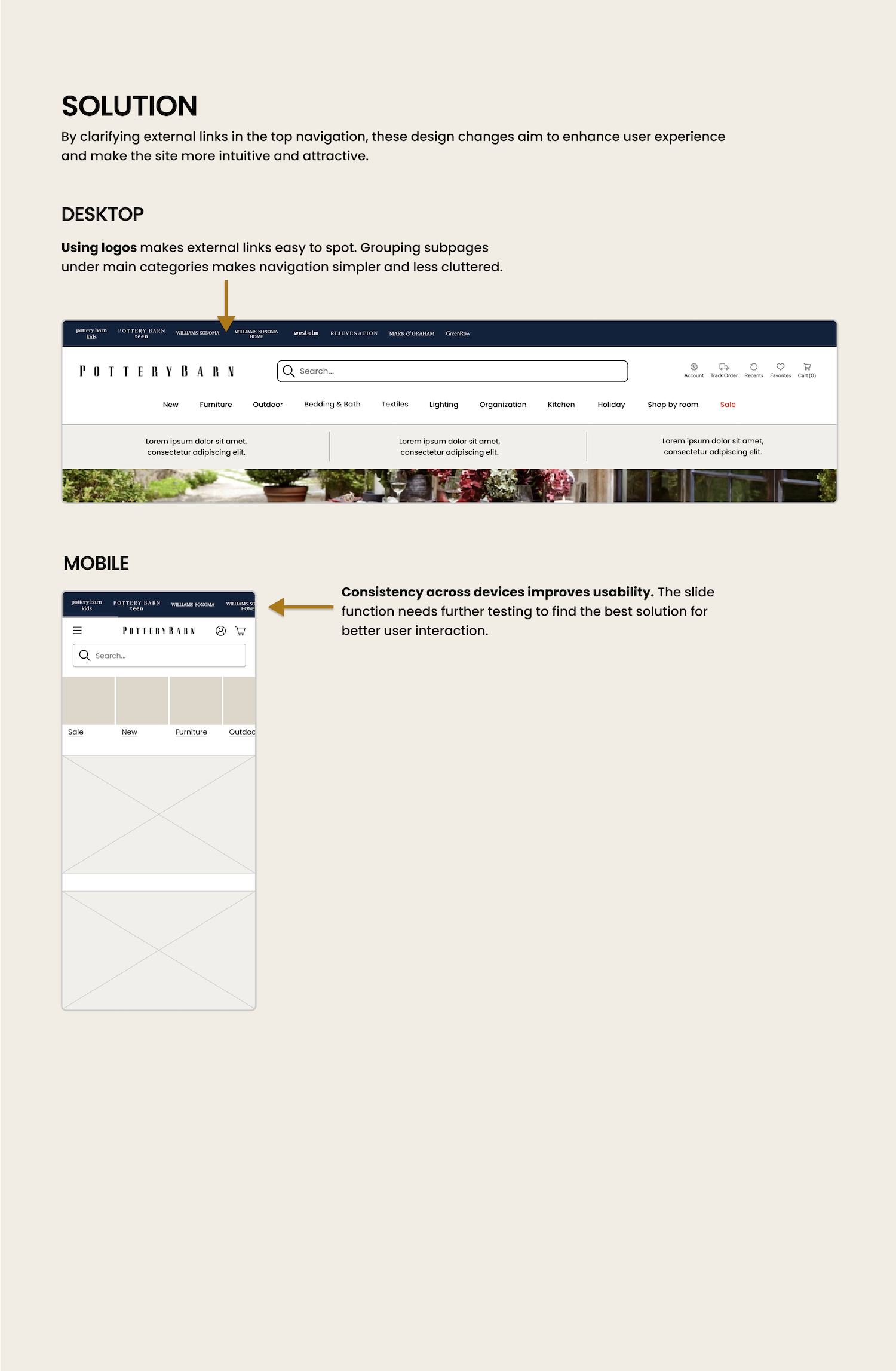
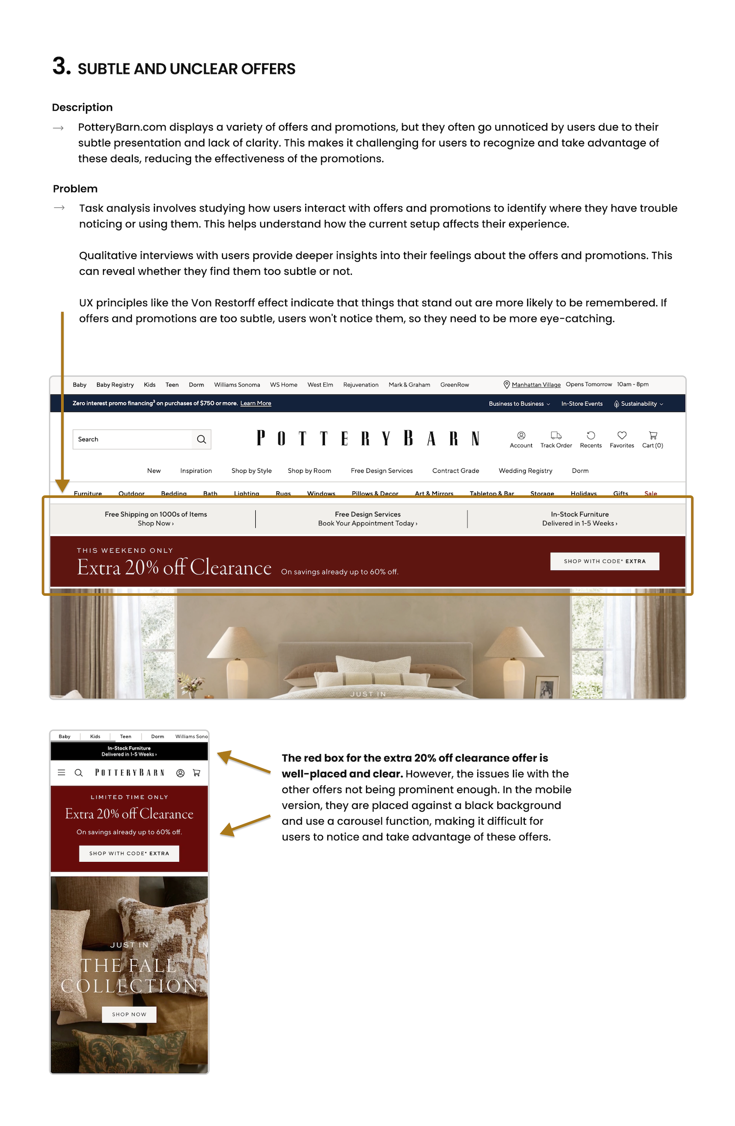
The work centred on simplifying navigation, clarifying promotions, and reducing visual noise. Product discovery and filtering were reviewed closely to help users find what they’re looking for without unnecessary steps.
Promotional content was restructured to support clarity rather than compete for attention, and the overall hierarchy was adjusted to create a calmer, more consistent experience. The result is a site that feels easier to move through and more aligned with everyday use.
The project highlights how small structural changes can make a complex e-commerce experience feel more manageable.